.jpeg)
Colour of the Year 2025
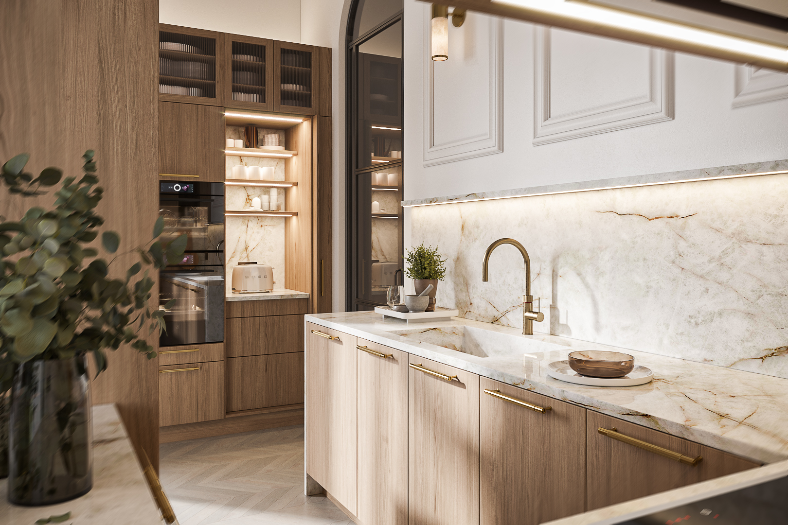
For a modern but comfortable kitchen, designers are incorporating rich dark browns with metallic accents, such as brushed brass or copper. These finishes elevate the space, adding a sense of glamour while maintaining its earthy charm.
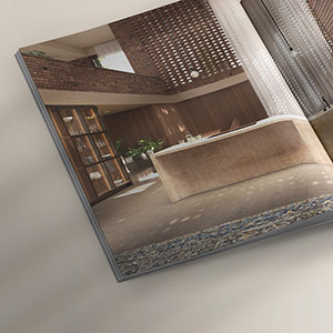
This design shows the combination of wood, warm chocolate tones and brass.
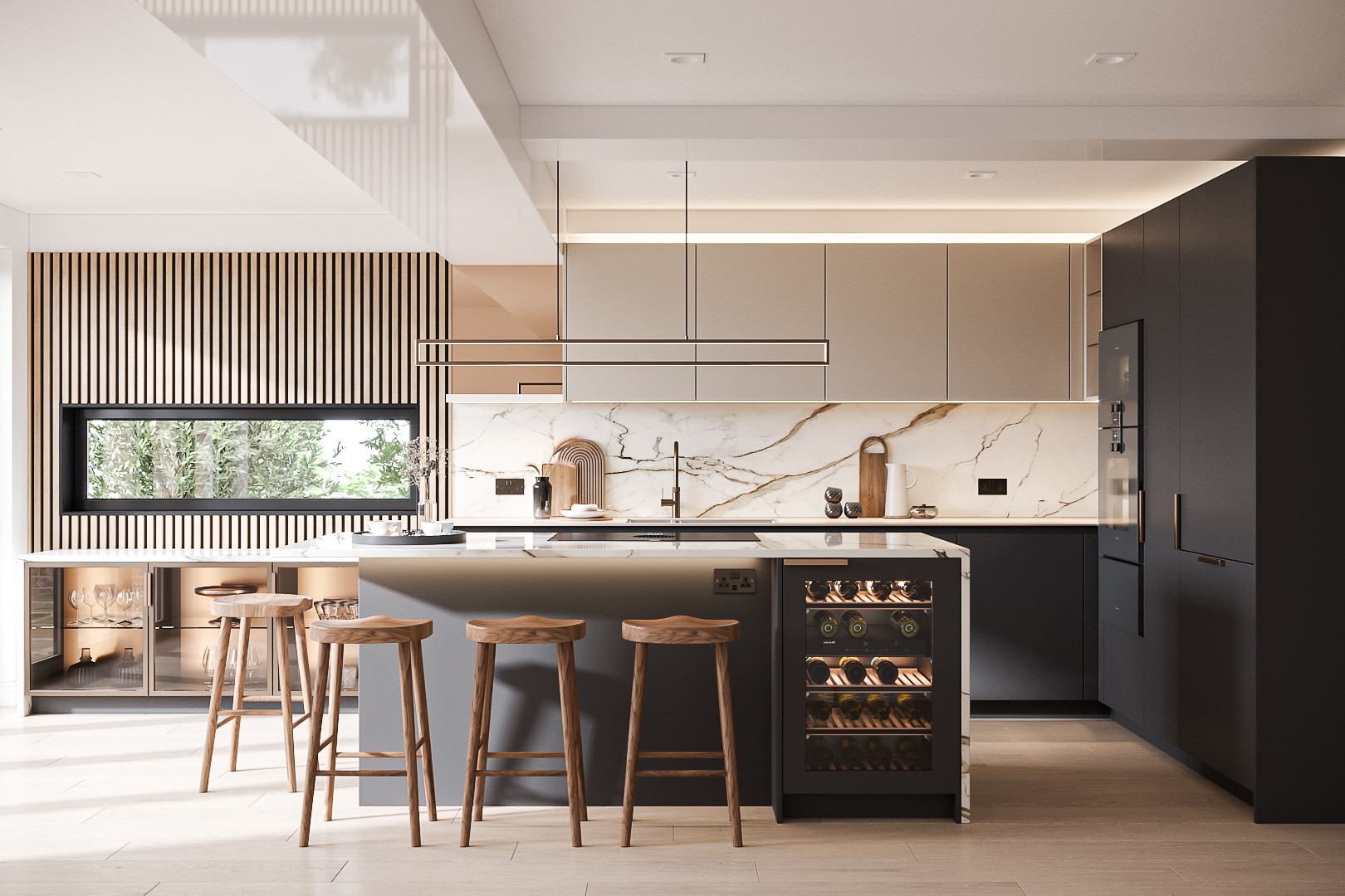
Across interiors, these shades of neutral browns exemplify a growing preference for ‘quiet luxury’ - a style that prioritises subtle, sophisticated elements over overt opulence. This hue anchors both minimalistic and maximalist spaces, providing flexibility across styles.
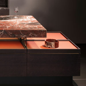
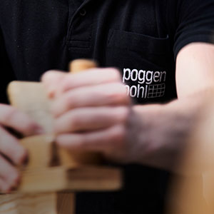
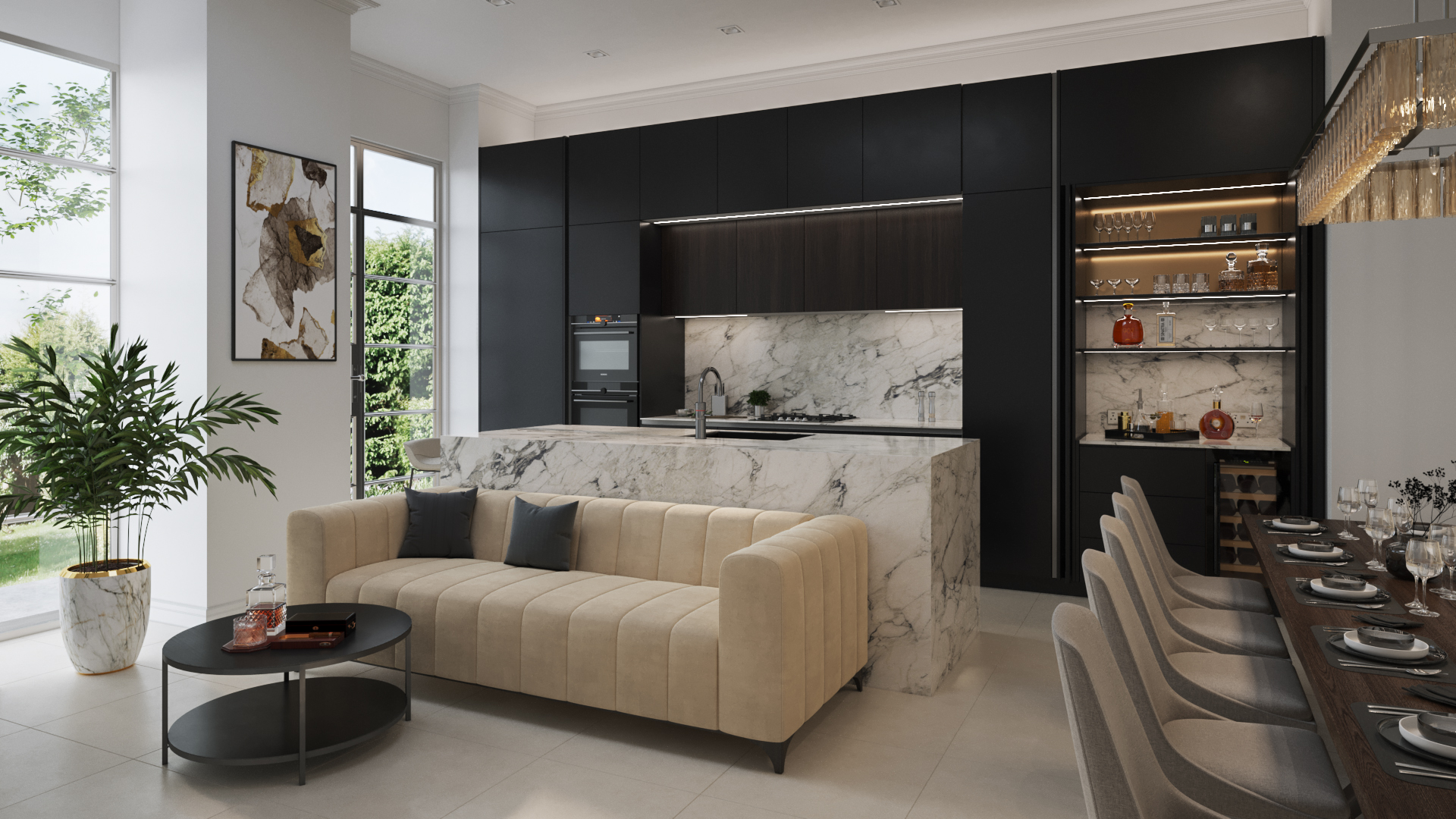
From the team at the Wigmore Street Poggenpohl Studio, this design incorporates luxury with elements of glamour.
The choice of these neutral, warm and inviting tones aligns with the societal shifts towards self-care and creating welcoming living environments. Pantone's Executive Director, Leatrice Eiseman, describes Mocha Mousse as a shade that embodies "thoughtful indulgence"—a combination of aspirational luxury and grounded simplicity. In this fast-paced digital age, this colour reminds us to slow down and appreciate tactile, comforting spaces.
In more rustic spaces, this pale chocolate tone acts as a complementary base to lighter, neutral tones like cream or taupe. When paired with textured materials like stone counters, it evokes a sense of lived-in warmth that’s perfect for communal cooking and dining.
Poggenpohl kitchens are designed to flow seamlessly into living and dining areas. Using neutral tones across cabinetry or wall panels ensures a cohesive design, especially when paired with other warm tones that align perfectly with Poggenpohl’s ethos of creating spaces that are both functional and elegant.
Whether you’re planning a kitchen overhaul or simply seeking inspiration, this rich brown hue offers endless possibilities for creating a space that feels as comforting as it is cutting-edge. Ready to explore the potential of a Poggenpohl kitchen? Let this luxurious shade inspire your next design transformation.
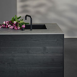
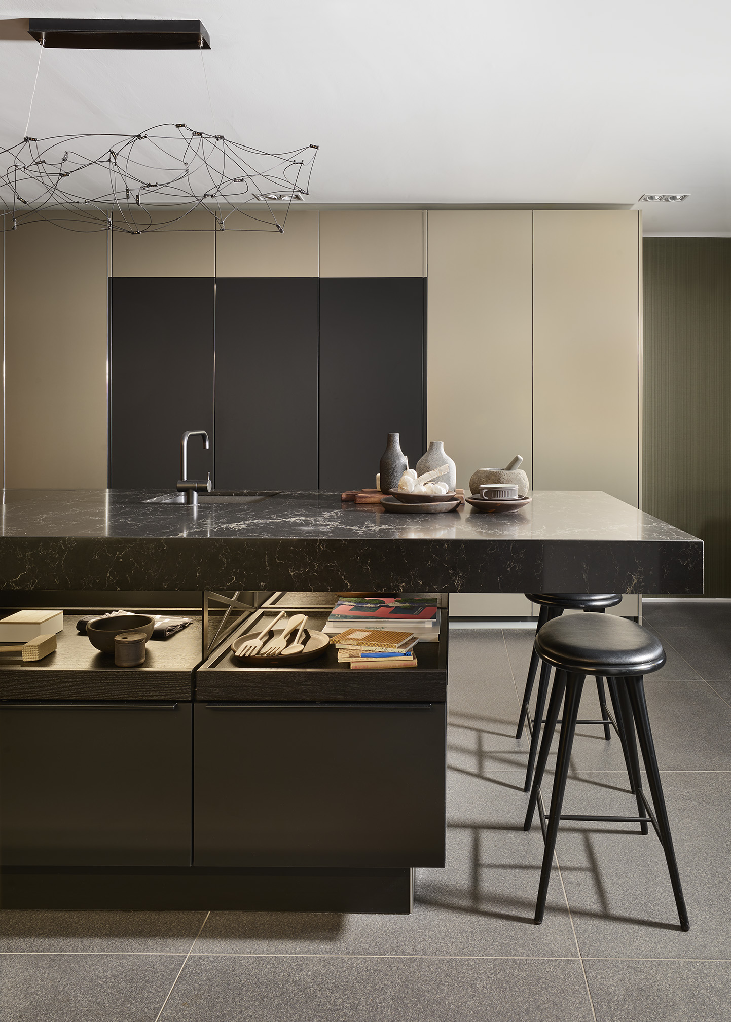
From the team at Poggenpohl, Marlow. The famous +MODO in shades of browns and chocolates.
Book your design consultation now
OUR AWARDS


